Let’s Play! | WYSO Brand Identity
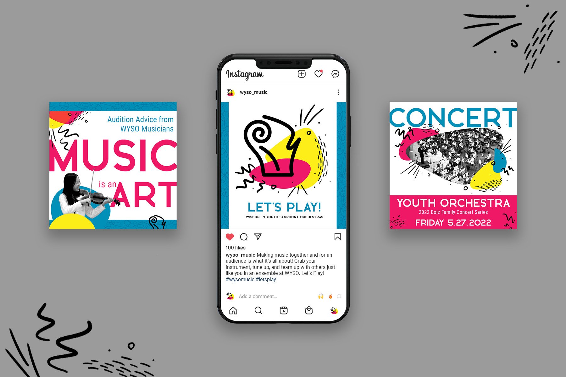
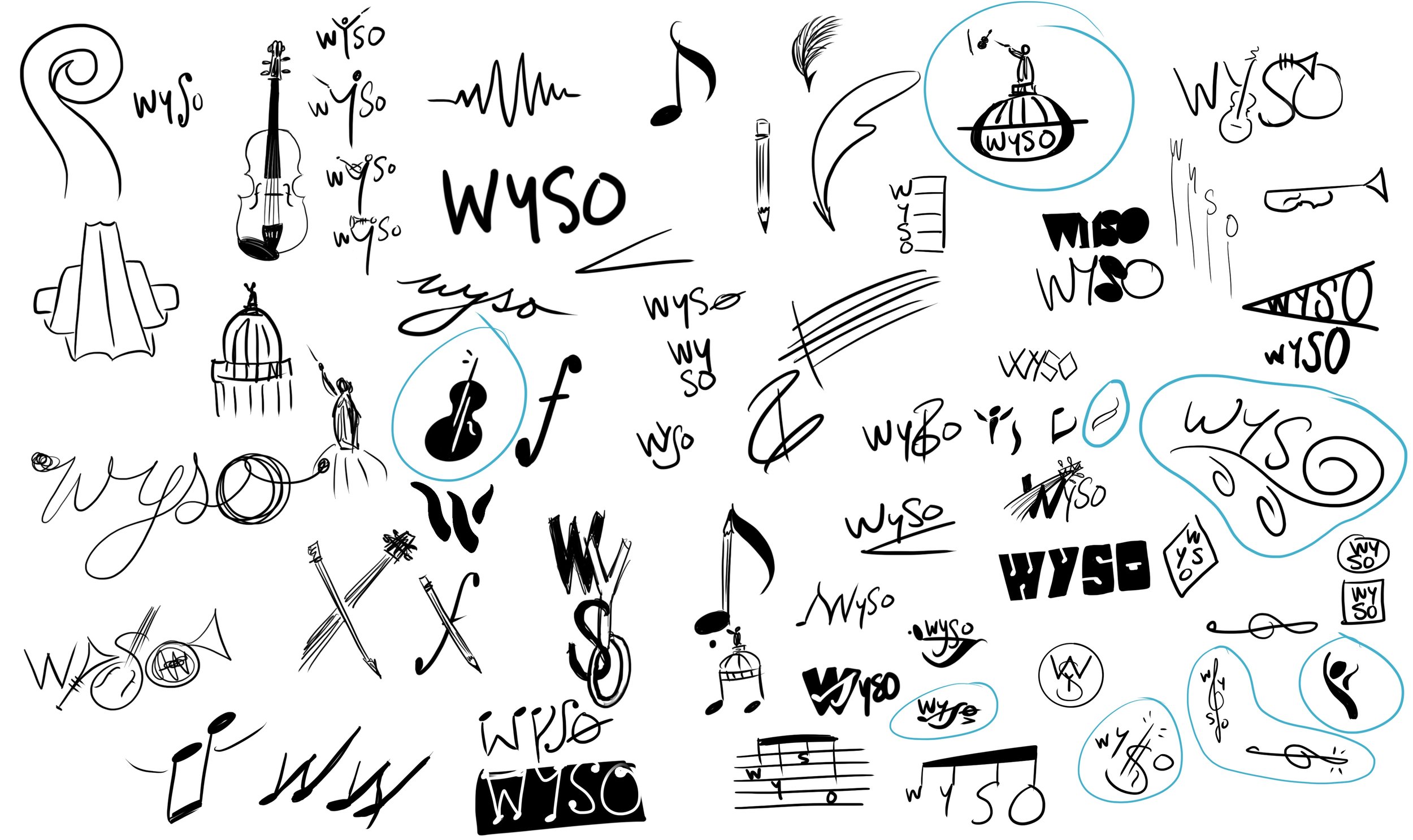
The Wisconsin Youth Symphony Orchestras is all about young people learning and making music together. In this fresh brand identity, the new logo brings a double bass scroll and the shape of the state of Wisconsin together in one memorable icon. The colors are near-primary, calling to the educational aspect of the organization. Dynamic shapes give the brand a feeling of movement and energy. The decorative doodles each represent a section of the orchestra: layered hashmarks for the sonorous woodwinds, gestural swishes for the lush strings, sharp outward lines for the blaring brass, and dots and circles for the striking percussion. Let’s Play! | student work
Skills: Photo editing, illustration, logo design + animation, digital design, website design, branding
Programs: Photoshop, Procreate, Illustrator


